Styles
Using this Component
Text boxes enable users to input single-line text or numerical values. Use text boxes where a flexible typed input is required.
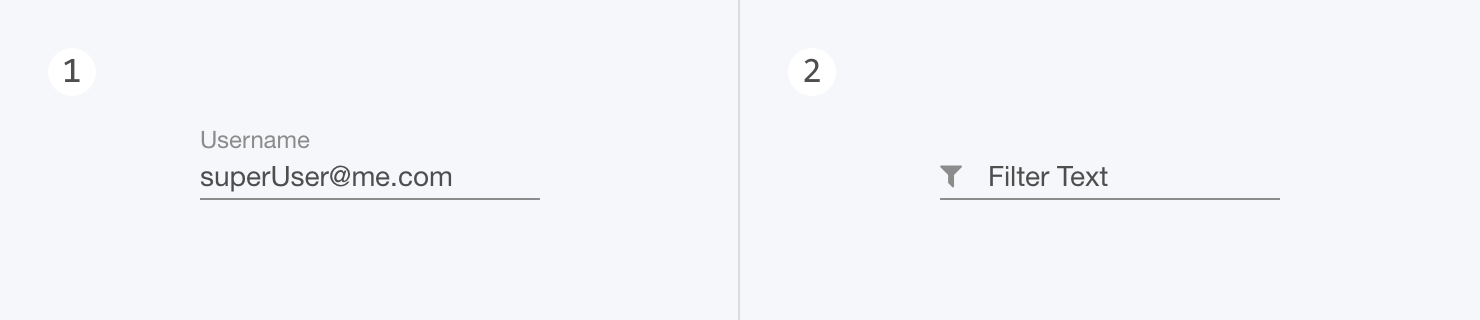
Types
1. None (Normal)
For informational, or neutral messages.
2. Filter
For success alerts, or other positive messages.
Applications
Applications of text boxes include settings fields, username/password sign-in fields, and filter fields.
Labels
Text boxes have a built in label prop. To provide more context to the input task being presented to the user, the text box can be used beneath a UIHeader and descriptive text block.
Alternatives
For input values longer than a single line, use UIMultiLineTextBox. If the user is required to select between preset options, use a different form field instead (e.g. UIMenu, UIRadio, UICheckbox).
Structure
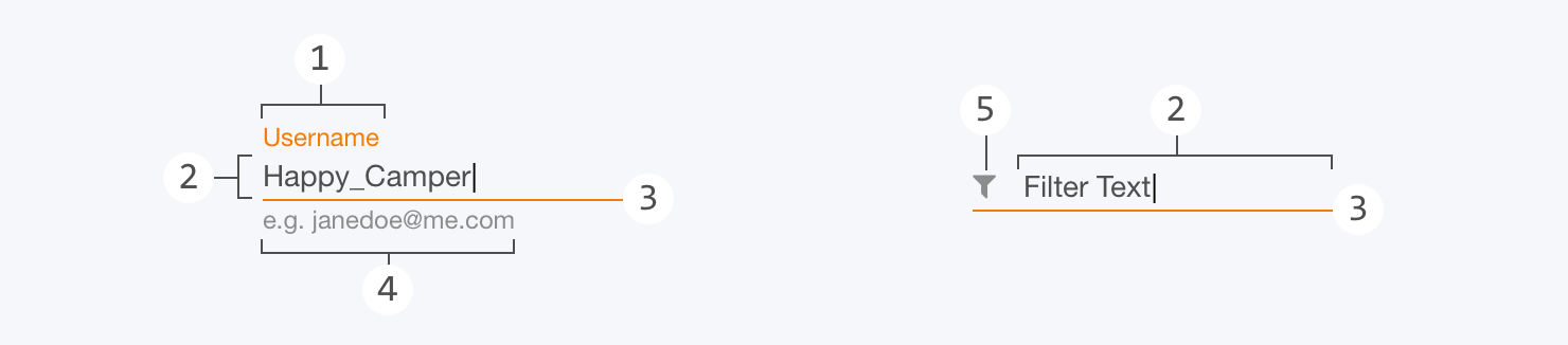
1. Label
All text boxes allow for a label of the text input area. When inactive and empty, this label takes the place of the input text. When active or filled, the label appears directly above the input text. This is field is required for all text boxes that are not of type filter.
2. Text Input Area
The text input area is the interactive area that allows a user to enter a value. When inactive and empty, the text box label displays in this space. An optional pre-filled value can be shown here, and is overwritten when a user enters a new value.
3. Text Input Border
The underline of the text input area visually indicates the width of the interactive area, as well as the current state of the text box.
4. Helper / Placeholder Text
Helper text is displayed beneath the text input area. This text can be shown as default (for examples or neutral messaging), error (for errors and failures), or success (for positive messaging).
5. Icon (Filter Type)
For filter type text boxes, an icon can be placed left-aligned in the text input area. Unlike a label, this icon retains its placement regardless of a user’s interactions. The icon prop allows for the use of any icon, but if the text box is being used as a filter, then the Quilt icon `filter` should be used.
Size
The width of the text box should reflect the expected length of the text inputs. For example, a “zip code” field would be shorter than an “address” field.
Behavior
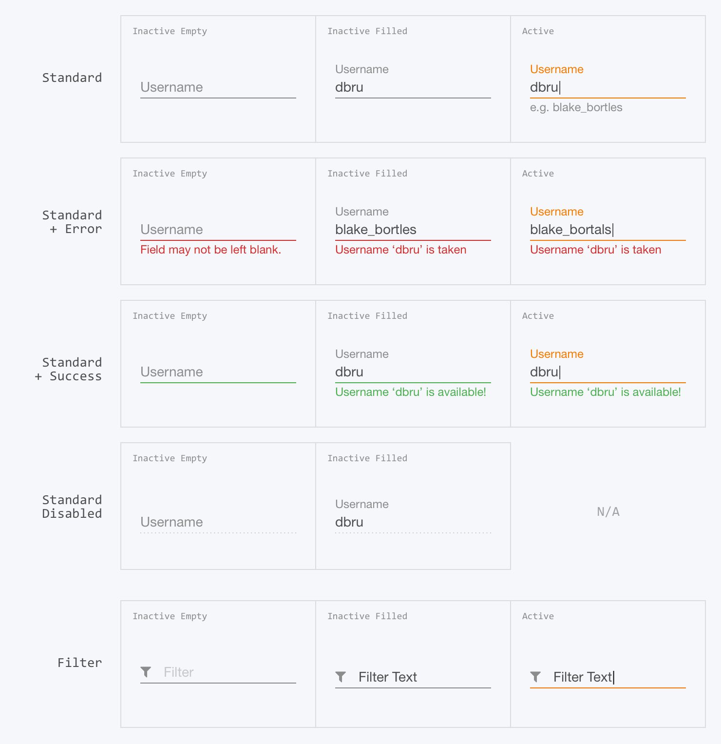
Text boxes are directly interactive elements that visually reflect their current state using label placement, and color (of the text input border and/or helper text).
Typing
When active, users can type any string into the text box, and the value displayed will reflect their input. When a text box is used as a password input, all typed characters are obscured.
Truncation & Overflow
The content of a text box is limited to a single line of text. If the value exceeds what can be displayed on screen, the text string will display a truncated value. The truncated value can be navigated using the arrow keys when the type cursor is active in the text box.
Helper Text
When using text boxes to convey information about the current input value, the helper text can be used. This should change from default placeholder to error or success to mirror the content of the message. For example, if a typed password is incorrect, helper text as an error should be used. These messages should change/disappear when the input values change.
Related Components

Playground Coming Soon!
Styles
Using this Component
Text boxes enable users to input single-line text or numerical values. Use text boxes where a flexible typed input is required.
Types
1. None (Normal)
For informational, or neutral messages.
2. Filter
For success alerts, or other positive messages.
Applications
Applications of text boxes include settings fields, username/password sign-in fields, and filter fields.
Labels
Text boxes have a built in label prop. To provide more context to the input task being presented to the user, the text box can be used beneath a UIHeader and descriptive text block.
Alternatives
For input values longer than a single line, use UIMultiLineTextBox. If the user is required to select between preset options, use a different form field instead (e.g. UIMenu, UIRadio, UICheckbox).
Structure
1. Label
All text boxes allow for a label of the text input area. When inactive and empty, this label takes the place of the input text. When active or filled, the label appears directly above the input text. This is field is required for all text boxes that are not of type filter.
2. Text Input Area
The text input area is the interactive area that allows a user to enter a value. When inactive and empty, the text box label displays in this space. An optional pre-filled value can be shown here, and is overwritten when a user enters a new value.
3. Text Input Border
The underline of the text input area visually indicates the width of the interactive area, as well as the current state of the text box.
4. Helper / Placeholder Text
Helper text is displayed beneath the text input area. This text can be shown as default (for examples or neutral messaging), error (for errors and failures), or success (for positive messaging).
5. Icon (Filter Type)
For filter type text boxes, an icon can be placed left-aligned in the text input area. Unlike a label, this icon retains its placement regardless of a user’s interactions. The icon prop allows for the use of any icon, but if the text box is being used as a filter, then the Quilt icon `filter` should be used.
Size
The width of the text box should reflect the expected length of the text inputs. For example, a “zip code” field would be shorter than an “address” field.
Behavior
Text boxes are directly interactive elements that visually reflect their current state using label placement, and color (of the text input border and/or helper text).
Typing
When active, users can type any string into the text box, and the value displayed will reflect their input. When a text box is used as a password input, all typed characters are obscured.
Truncation & Overflow
The content of a text box is limited to a single line of text. If the value exceeds what can be displayed on screen, the text string will display a truncated value. The truncated value can be navigated using the arrow keys when the type cursor is active in the text box.
Helper Text
When using text boxes to convey information about the current input value, the helper text can be used. This should change from default placeholder to error or success to mirror the content of the message. For example, if a typed password is incorrect, helper text as an error should be used. These messages should change/disappear when the input values change.