Styles
Using this Component
Headers are used to label and define sections of content on a page. They also may contain actions relevant to the section.
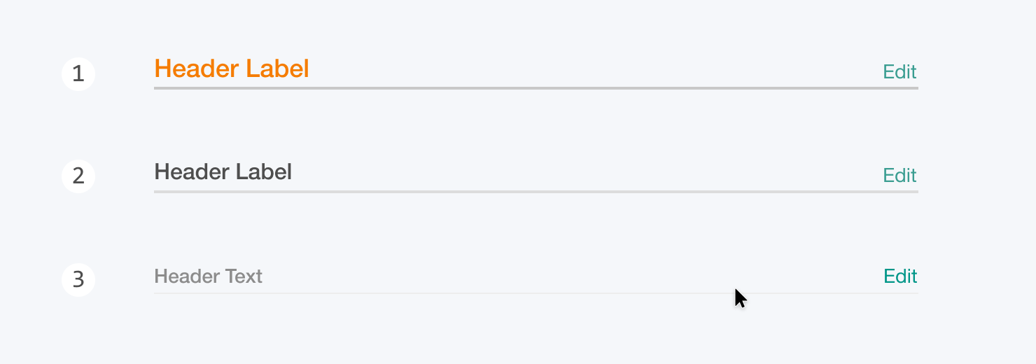
Levels
1. High
Equivalent to an h1 header. For defining major sections of a page.
2. Medium
Equivalent to an h2 header. For defining subsections of a page. Only used within sections defined by a high level header.
3. Low
Equivalent to an h3 header. For defining sub-subsections of a page. Unlike other styles, the underline is only shown on hover.
Header Text
Header text is critical for for creating quickly understood interfaces. Text should label the section content as clearly and concisely as possible. Use title case for all headers.
Actions
Actions are not required on a header, and each header should have as few actions as possible. Actions placed on a header should be broadly relevant to the contents of the section. If an action is specific to only one part of a section, then that action should be placed inline with the content, or on a sub-section header.
Alternatives
UIHeaders should be used only to label sections of a page. To label entire pages, use UIPageHeader.
Structure
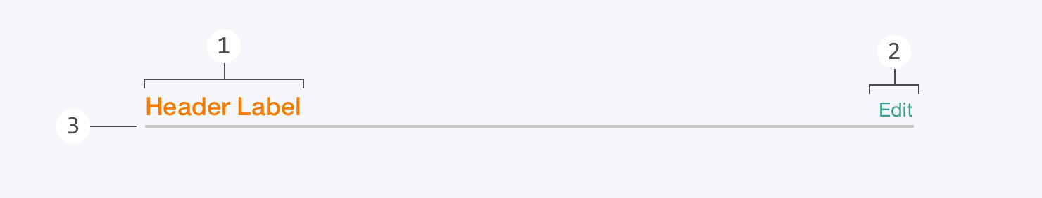
1. Header Text
Every header has a single line of title case text. The styling of this text correlates to the level of the header.
2. Actions
Headers may contain one or several actions aligned to the right side of the underline. They most commonly take the form of a UITextButton or icon button.
3. Underline
All headers have an underline that spans the width of the section defined by the header.
Behavior
Basic headers are not directly interactive elements, and serve only to label and define sections. Headers with actions are interactive, both in the actions themselves, and in how the actions are displayed.
Header Action Visibility
By default, actions are only visible on hover over the section defined by the header. For example, if a section contains a list of items, hovering the cursor over any of those items would cause the header actions to become visible. This can be overridden so that header actions are always visible regardless of cursor position.
Truncation
When a responsive-width header becomes too narrow to display the full header text, the text is truncated with an ellipsis (“…”). Truncation should be avoided wherever possible.
Related Components

Playground Coming Soon!
Styles
Using this Component
Headers are used to label and define sections of content on a page. They also may contain actions relevant to the section.
Levels
1. High
Equivalent to an h1 header. For defining major sections of a page.
2. Medium
Equivalent to an h2 header. For defining subsections of a page. Only used within sections defined by a high level header.
3. Low
Equivalent to an h3 header. For defining sub-subsections of a page. Unlike other styles, the underline is only shown on hover.
Header Text
Header text is critical for for creating quickly understood interfaces. Text should label the section content as clearly and concisely as possible. Use title case for all headers.
Actions
Actions are not required on a header, and each header should have as few actions as possible. Actions placed on a header should be broadly relevant to the contents of the section. If an action is specific to only one part of a section, then that action should be placed inline with the content, or on a sub-section header.
Alternatives
UIHeaders should be used only to label sections of a page. To label entire pages, use UIPageHeader.
Structure
1. Header Text
Every header has a single line of title case text. The styling of this text correlates to the level of the header.
2. Actions
Headers may contain one or several actions aligned to the right side of the underline. They most commonly take the form of a UITextButton or icon button.
3. Underline
All headers have an underline that spans the width of the section defined by the header.
Behavior
Basic headers are not directly interactive elements, and serve only to label and define sections. Headers with actions are interactive, both in the actions themselves, and in how the actions are displayed.
Header Action Visibility
By default, actions are only visible on hover over the section defined by the header. For example, if a section contains a list of items, hovering the cursor over any of those items would cause the header actions to become visible. This can be overridden so that header actions are always visible regardless of cursor position.
Truncation
When a responsive-width header becomes too narrow to display the full header text, the text is truncated with an ellipsis (“…”). Truncation should be avoided wherever possible.